You found the perfect shade of green on Instagram. It looked incredible—moody, sophisticated, exactly the vibe you envisioned for your primary bedroom suite. You tracked down the exact paint code, had the space completely coated, and stepped back expecting magic. Instead, the room felt flat, uninviting, and completely jarring.
This happens constantly. And it is not because the color itself was wrong. It is because the palette was selected based on how it looked in a two-dimensional photograph rather than how it interacts with the physical, three-dimensional reality of your specific architecture.
In high-end design, color is not merely a cosmetic finish. It is an emotional foundation. Achieving a home that feels right requires understanding the subtle, subconscious relationship between human psychology, spatial volume, and light.
Why Color Feels Before It Looks
The human brain processes color emotionally long before it recognizes the visual aesthetic of a room. Colors trigger immediate, primal psychological responses that impact your nervous system, heart rate, and comfort levels. A cool, stark shade can quietly introduce subtle anxiety into a room, while a warm, grounded tone can instantly lower your shoulders after a demanding day.
This hidden emotional resonance is precisely why a color palette that works beautifully in a magazine or a showroom can feel completely wrong in your home. Color does not exist in isolation. It shifts and mutates based on surrounding materials, architectural heights, and natural light sources. Choosing colors that work means choosing colors that feel right when you are living inside them—not when you are scrolling past them.
What Different Colors Actually Do to a Room
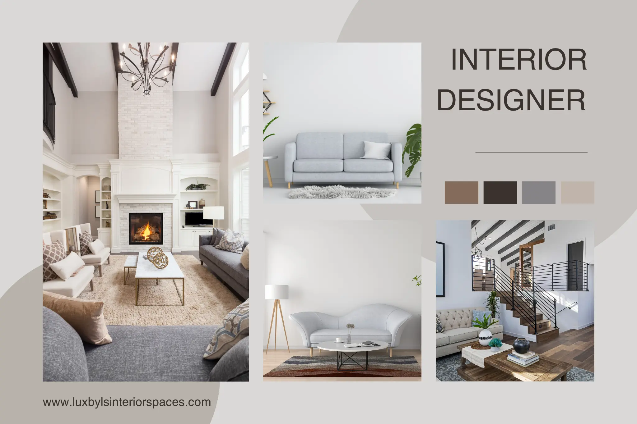
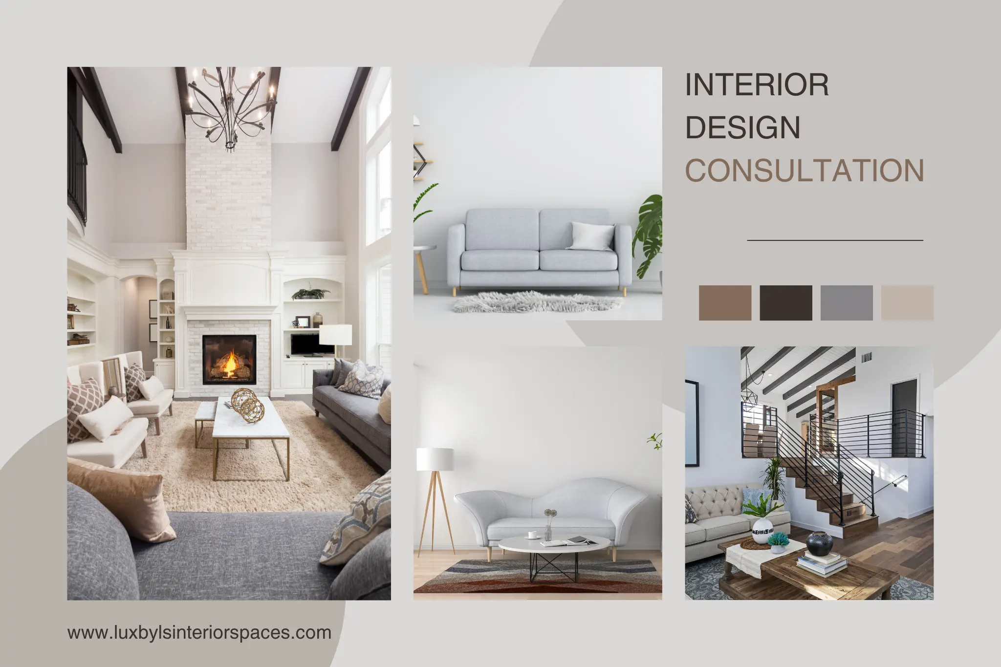
Warm Neutrals — Restraint and Architectural Sophistication
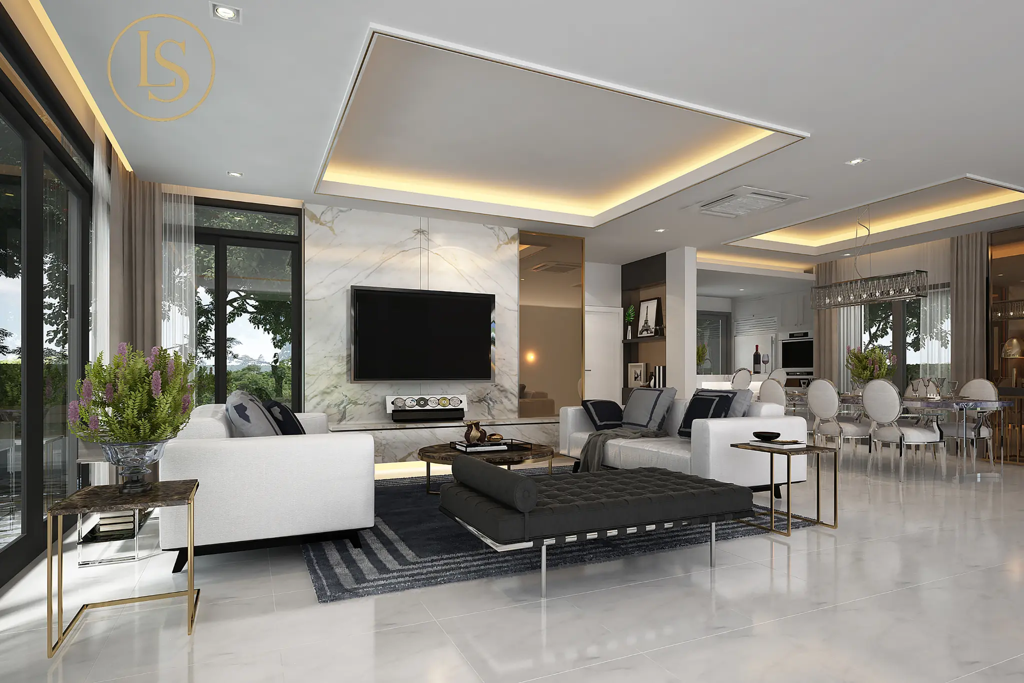
Modern luxury is shifting away from stark minimalism toward spaces that feel layered, cozy, and deeply restorative. Warm neutrals—such as soft parchments, refined taupes, and delicate mushrooms—are the cornerstone of a sophisticated home. These tones project a sense of quiet restraint. They provide a calm visual anchor that allows high-end furniture silhouettes and rich textures, like bouclé, custom millwork, and brushed brass, to stand out without competing for attention.
Deep Blues & Moody Greens — Serenity Without Austerity
Deep jewel and forest tones possess a unique psychological weight. Navy, indigo, deep sage, and rich olive greens bring an immediate sense of quiet security and intellectual calm to a space. Unlike stark dark grays or blacks, which can occasionally feel clinical, these organic tones offer depth without coldness. They sit in a psychological sweet spot, working beautifully in private library spaces, home offices, and primary suites where you want to feel settled.
Rich Earth Tones — Grounded and Intimate
Earthy pigments—including muted terracotta, warm ochre, sienna, and deep chocolate brown—create rooms that feel like a warm embrace. These tones bring immense depth and intimacy without heaviness. Earth tones work especially well in spaces designed for conversation and connection—dining rooms, formal living spaces, and cozy lounge areas. They pair naturally with raw materials like walnut, leather, linen, and natural stone, making them effortless to build a luxury palette around.
The Nuances of White — Pristine but High-Risk
White is undeniably the most complex color family to master. A pristine, gallery-white home looks exceptionally crisp when executed correctly, but it carries a high risk of feeling sterile or flat if handled poorly. White reflects everything around it. If your white paint has a cool blue undertone, it will look clinical under overcast skies. If it has too much yellow, it can look dated in evening light. A successful white kitchen or gallery hall requires a meticulous balance of warm architectural undertones and rich, tactile material layering.
Bold Accents — Personality in Small Doses
Vibrant, highly saturated colors like deep crimson, mustard yellow, or plum carry immense energy. While painting an entire room in these tones can easily overwhelm the senses and cause visual fatigue, using them in calculated, intentional doses injects immediate personality. A bold hue is best utilized on a piece of custom upholstery, the interior of a built-in bookshelf, a powder room ceiling, or a statement piece of fine art.
The 60-30-10 Rule (And When to Break It)
To balance these emotional weights seamlessly, designers often rely on a classic color theory framework known as the 60-30-10 rule. This formula breaks down the visual composition of a space into three distinct proportions to maintain balance:
-
60% Dominant Color: This forms the primary background of the room, typically covering the walls, large-area rugs, or substantial built-in cabinetry blocks.
-
30% Secondary Color: This provides visual support and contrast, usually represented by window treatments, accent furniture pieces, and distinct flooring materials.
-
10% Accent Color: This delivers the final pop of personality, distributed throughout the space via fine art, custom throw pillows, lighting fixtures, and unique accessories.
While this rule provides a foolproof baseline for balance, breaking it intentionally is how a custom home transitions from standard beauty into true artistry. For instance, in a luxury primary suite, you might compress the palette into a monochromatic 90-10 split—using varied textures of the exact same warm ivory across 90% of the space, accented by just 10% dark walnut. This deliberate rule-breaking strips away visual static, maximizing a sense of deep, hotel-like serenity.
How Lighting Changes Everything About Color
This is the single biggest mistake made with color: choosing a paint swatch under the fluorescent lights of a showroom or hardware store and expecting it to look the same at home.
Color does not exist without light. And the natural orientation of your light will completely alter a paint's pigment. This reality is particularly vital for custom properties throughout the Greater Houston area, where the brilliant, intense Texas sun behaves very differently depending on the direction your windows face.
-
North-Facing Rooms: These spaces receive cool, diffused, and slightly bluish natural light all day long. Cool grays or stark whites will look flat and dark here. To balance the cool northern atmosphere, you must use colors with warm, soft undertones to keep the room feeling inviting.
-
South-Facing Rooms: These rooms are flooded with intense, golden light from morning until late afternoon. While this light is gorgeous, it can completely wash out soft pastel colors or amplify warm tones until they feel overly hot. South-facing spaces can easily handle cooler neutrals, soft blues, and crisp, clean whites that temper the warmth of the sun.
Because of this constant environmental shift, a luxury design process requires painting large, multi-foot sample patches directly onto the actual walls. You must observe how the color shifts from morning to afternoon to evening lamplight. If you skip this step, you are gambling with something you will look at every single day.
How a Designer Approaches Color Differently Than a Homeowner
Most homeowners pick colors one decision at a time. First the wall color, then the sofa fabric, then the rug, then the curtains. Each choice feels right in isolation, but the finished room often fails to feel cohesive because the individual choices aren't connected.
Designers work the opposite way. We build an entire architectural palette simultaneously before committing to a single finish.
A designer never looks at a paint deck in isolation. We analyze how the wall color will interact with the undertones of your European oak flooring, the veining of your custom quartzite kitchen island, the weave of your Belgian linen drapery, and the reflection of your architectural lighting layout. We map out the visual transitions from room to room, ensuring that as you walk through your home, the emotional tone shifts naturally and fluidly. To see how these complete material palettes come together in real-world luxury environments, you can explore our completed interior design portfolio.
Frequently Asked Questions
Why should paint selection always be the absolute final step in a design palette?
There are thousands of paint colors available on the market, but there are only a limited number of perfect luxury slab surfaces, custom rug weaves, or fabric textures. It is incredibly easy to tint a paint base to perfectly match the undertone of a rare marble counter or a bespoke sofa fabric. However, it is nearly impossible to find a sofa fabric that seamlessly coordinates with an arbitrary paint color you have already applied to your walls. Always lock in your hard materials and textiles first.
What are the most timeless interior paint colors?
Timeless colors are those that mirror nature and maintain complex, muted undertones. Rather than choosing bright, pure primary pigments, look for "muddy" colors—whites with soft stone undertones, grays with subtle green bases, and warm taupes that shift slightly depending on the light. These complex mixtures sit quietly in the background, outliving temporary internet design trends and adapting effortlessly as your furniture and art collections evolve over decades.
How many colors should be in one room?
Three to five is the comfortable range for most rooms: one dominant, one secondary, and one to three accent tones. More than five starts to feel busy unless you are working with a very intentional maximalist palette. Fewer than three can feel flat. The key isn't the number—it's the proportional relationship between them.
How do you use "fifth wall" (ceiling) color detailing to alter a room’s volume?
The ceiling is one of the most underutilized design canvases in a residential home. Painting the ceiling a pure, bright white while the walls are dark can create a stark visual break that actually makes a ceiling feel lower. If you want an intimate, grand, or library-like feel, wrap the wall color seamlessly all the way up across the ceiling to eliminate boundaries. Conversely, in a room with soaring double-height ceilings, painting the ceiling a warm tone that is one or two shades darker than the walls can bring the space down to a more human, comforting, and sophisticated scale.
Start With How You Want to Feel
Before you open a single paint can or browse a single fabric swatch, ask yourself one question: how do I want this room to feel?
Calm. Energized. Cozy. Open. Dramatic. Quiet. That answer is your compass. Every color decision flows from it. When you start with feeling instead of fashion, you end up with a home that doesn't just look designed—it feels entirely like yours.
If choosing the right palette for your custom home build, premium renovation, or boutique commercial space feels overwhelming, you are not alone. A single professional consultation can bring more clarity than months of browsing samples.
Book a consultation with LUXbyLS Interior Spaces today, and let’s find the perfect color palette your home has been waiting for.